
Although my wedding has long come and gone, there are still a handful of DIY projects I wanted to share but never got around to – nothing wrong with sharing them after the wedding, right? Today I wanted to talk about how I made my place cards. I loved how they turned out, and they surprisingly seemed to be quite popular at our wedding. A few of our guests even told me they took theirs home, which is hilarious because I’m not sure what you would do with a place card after the wedding 😝 This was quite a tedious process that took me months to finish bit by bit, but I enjoyed the process. I also went through several shows on Netflix while working on it, so it was a win-win. If you have any bridesmaids that are willing to give a hand (or be voluntold by the bride), that would probably be a great help!
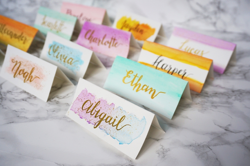
Since my general wedding design was watercolour, the place cards featured a watercolour background with champagne-gold splatters and hand-lettering that I did myself. The gold splatters are optional – our wedding colours were blush and dusty blue, but we ended up with a lot of gold accents in our décor, so I thought the gold splatters would be a nice tie-in with the rest of the room.
Supplies:
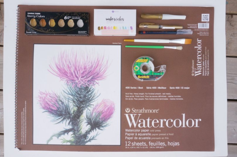
Watercolour paper – I used Strathmore Watercolor paper
Watercolour paints – I used Prisma Watercolor Confections
Gold watercolour paint – I used Gansai Tambi Starry Colours palette
Medium flat brush
Small coarse bristle brush
Paint tape
Handlettering supplies – My recommendations will be mentioned below
A little more info on the paints I used: For my watercolours, I purchased the Prisma Colors Watercolor Confections from Simon Says Stamp. The first time my husband saw me using the watercolours, he said they looked like little candies, and they really do look like Starbursts – hence the name! The paints even come wrapped individually in coloured wrap like Starbursts do. For the gold paints, I used the Gansai Tambi Starry Colours palette. There is another gold watercolour palette available out there that seems to be a more popular option, but this one was a cheaper dupe for it.

Now onto making the place cards! The first step is to make the actual place cards. You can buy packs of blank place cards at stationery stores, but since we are working with watercolours, the place card will need to be made of watercolour paper. I couldn’t find any pre-made watercolour place cards in stores or online, so I had to make my own.
1) To start the place cards, you will have to cut out rectangles which will be folded in half into a triangular shape to sit on the table. Unless you’re particularly gifted at cutting in straight lines without guidelines, the first step is to draw guidelines on your paper to guide your cutting. I tested out different sized place cards to see which one I liked best, before finally settling for ones that were 4 inches wide by 2.25 inches tall. Remember that the rectangle you cut out will be folded in half to make a tent shape, which means the height of the rectangle has to be double the desired height. For example, my 4 inch wide x 2.25 inch tall place cards required rectangles that were 4 inches wide by 4.5 inches tall.


2) Once you’ve cut out your rectangle cards, fold it in half. Pretty self-explanatory, right? 😝 Watercolour paper is thicker than normal paper, so it doesn’t fold into a very clean edge. I recommend taking something heavy to press down on the edge so that it turns out nice and sharp.
3) Now that the boring steps are out of the way, we can finally get onto the more artsy parts of the project! Next, we make the watercolour background. There are so many different designs you can do (which you can see in the featured image), but I chose to do a messy wash for our wedding. To use the watercolour paint, wet your flat brush with water, dip it into the paint, and sweep the brush back and forth onto the paper in no particular pattern. Repeat until you get the desired opacity. It doesn’t have to be perfect, nor does each card have to look exactly the same – in fact, the point of watercolours is that it’s supposed to look a bit “undone”!

4) After the watercolours are dry, you can start on the gold splatters. I wanted the splatters to only be on the area that was covered in watercolour, so I used paint tape to cover the white areas. In the photo below, I used regular tape to demonstrate, but I would highly suggest using paint tape, as regular tape will rip the paper when you take the tape off. If you want the gold splatters all over the card, then there’s no need to use tape.

I used gold watercolour to make the splatters as it’s what I had on hand, but I would actually suggest using gold acrylic paint. Watercolour worked out fine, but was a little tricky to work with because the paint needs to have a pretty specific viscosity for the splatters to look good. If too much water is used, the splatters turn out a bit runny-looking. Long story short, acrylic paint will simply work best.
To make the splatters, I used a small coarse bristle brush, like this one below. I got it in a cheap set of paint brushes at the dollar store, and never thought I would have a use for it – it’s like a makeup lover’s worst nightmare because it’s so scratchy. However, it was perfect for making the flecks.

The method I used was to dip only the tip of the brush into the gold paint, and then I ran a finger back and forth across the bristles (like you do when you’re feeling how soft a makeup brush is) to splatter the paint onto the card. I originally tried placing the place card flat on the table, but I found that I produced better results when I kept the place card vertical (like the way it would normally sit on a table) while making the splatters. Just make sure you have a large scrap piece of cardboard or poster paper behind it so that stray splatters end up on the cardboard and not on any surfaces of your home.

Now that the watercolour design is is done, the final step is to write the guest names on the card in calligraphy or modern hand lettering. I am all for the idea that anyone can achieve anything, but to be honest, this is a pretty high learning curve if your writing normally looks like chicken-scratch. In this case, you have two options: purchase transparent labels to print the names and stick onto the place card, or enlist the help of a friend with good penmanship. I am absolutely not a pro at hand lettering, but I also didn’t want to pay for someone to do it felt like I could do a decent enough job to get by.
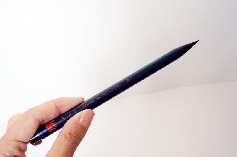
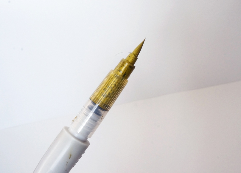
A little more info on my preferred hand-lettering tools: I had no intention of learning calligraphy using a traditional calligraphy pen before our wedding, as I knew I wouldn’t get the hang of it in that time. I purchased and experimented with several brush pens before I found one I liked. Brush pens have a flexible brush tip that allows you to control the thickness of your strokes, which easily allows you to hand-letter. My favourite brush pen is the Akashiya Sai brush pens, which are so easy to use. Unfortunately, I was dead set on having gold writing, and the Akashiya Sai pens don’t come in gold. I found and tried out the Kuratake Zig Wink of Luna brush pen in gold, which was equally easy to use, but the ink dried to a matte olive-gold colour (as you will see below). I also tried two more gold brush pens, and they gave me the same results except that the brush tips weren’t as good.
Ultimately, I settled on doing “faux calligraphy” using a regular gel pen because it was the true metallic gold I was looking for. It’s called faux calligraphy because, it imitates the look of calligraphy, but it’s not really calligraphy. Since you can’t control how thick the strokes are with a regular pen, I had to go back to the downstrokes of each letter and make them thicker.
This is the finished result of my blue and pink place cards (hehe, none of these names of our guests – I Googled “top baby names 2017” to come up with all the names you’ll see below):

This is what it looked like all set up at our actual wedding:

In terms of different designs, I tested out a bunch specifically for pictures for this blog post, and these were some of my favourites. I actually really like the ones where the watercolour covers the entire card and now wish that I had used that at our wedding!


That’s it – hope you enjoyed!

Those turned out beautifully!
LikeLiked by 1 person
Thank you so much!
LikeLike
Love this! ❤️
LikeLiked by 1 person
These look fantastic!! That’s such a creative way to personalize your wedding. I don’t know how you had time to make all of these, wedding planning is almost a full time job 😄
LikeLiked by 1 person
I definitely started these quite early in our wedding planning, and didn’t finish them till the very end, lol. Wedding planning is so time consuming, some of it was fun but I’m glad we don’t have to deal with it anymore in general!
LikeLike
Amen to that! I’m glad I only had to plan my wedding once!
LikeLike
Wow you have such beautiful calligraphy! Good job! 😄
LikeLiked by 1 person
Thank you so much, I’m glad you like them!
LikeLiked by 1 person
Once I took my placecard home from a wedding and used it as a bookmark. 😛 Maybe that’s what your guests did. Or put it on their work desk. 😆
You talking about the splatter reminds me of a series of Christmas card I made using a stencil and splatter technique – I used a toothbrush to make the splatter. 🙂
The calligraphy turned out so well! I can’t imagine the amount of time this whole process took. You can start a side gig creating these for other people’s weddings!
Side note: I know so many baby girls named Olivia!
LikeLiked by 1 person
Oooh a bookmark! That’s brilliant. Yes, one of our friends told us she took hers to work, haha! Maybe something to do with using watercolour paint vs a more viscous paint.
When I was working on the splatters for our wedding ones, my mom said she used to do it with toothbrushes too! We tried it but for some reason it didn’t work very well
It was very time consuming, but I really loved the whole process! Funny you should say that about starting a side gig doing these, because lately I’ve seriously been contemplating it. The thought of it is a little overwhelming and scary though! I don’t even know where to start.
Haha, makes sense you know many baby Olivias, it’s at the top of the list! A friend of mine is a teacher and says she knows a lot of Olivias too.
LikeLike
So creative, i love the colours and writing font!!
LikeLiked by 1 person
Oh thank you, it means so much to me that you like them!
LikeLiked by 1 person
These are beautiful! You’re really talented and creative I love it💖✨ stick to it
LikeLike
That means a lot to me, thank you!
LikeLike
Nice post! I love it ❤
LikeLike
Those are so beautiful! I always love that personal touch, and your handwriting is so precise ❤
LikeLiked by 1 person
The handwriting took a lot of practice, haha. Thank you so much for your kind words!
LikeLike
These look incredible, so beautiful x
LikeLiked by 1 person
Thanks so much!
LikeLike
They look beautiful! Really want to try something similar, especially the metallic paints (never used those before!). Thanks for sharing! 😃😃
LikeLiked by 1 person
You should definitely try it out, it’s a lot of fun! Would love to see your results 🙂
LikeLiked by 1 person
I think I will 🙂 those gansai Tambi watercolours have made it my Amazon wish list 😍
LikeLiked by 1 person
Yay! They’re so much fun to play with 🙂
LikeLiked by 1 person
These are lovely
LikeLike
They look beautiful. Such a good tip 🙂
LikeLiked by 1 person
Thank you!
LikeLiked by 1 person
[…] via Wedding DIY: Watercolour Place Cards — Polished and Inspired […]
LikeLike
These are beautiful. My niece is getting married in June…perfect. I will pass this info on. Thank you! 🙂
LikeLiked by 1 person
That’s awesome, congrats to your niece! Glad you liked these place cards 🙂
LikeLiked by 1 person
Thank you!
LikeLike
My wedding is coming up soon and I really enjoyed reading this!
LikeLiked by 1 person
Thank you, and congrats on your upcoming wedding!
LikeLike
lovely…
LikeLike