
Hello, everyone! Today’s post is a review of the ColourPop Salvaje palette which was added to my collection in early January, but I had not had a chance to test it out until the last few weeks. I have to be honest, I don’t really keep track of ColourPop releases because they come out with new products at such a rapid rate that I find it overwhelming. This was one of the products I did not know existed until I was browsing their website, but once I set my eyes on it, it was love at first sight. I am 100% a neutral gal, but something about the tones in this palette caught my eye!
THE BASICS
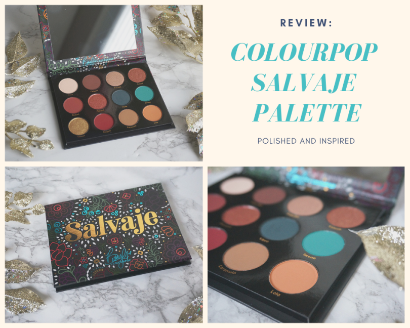
The Salvaje palette is a limited edition palette that contains 12 shades in a mix of mattes and metallics finishes, as well as neutrals and colourful shades. It was released in collaboration with Becky G, who is a Latina singer. It retails for $18 USD and can be purchased on the ColourPop website. All ColourPop products are made in the US.

THE PACKAGING
Typical of a ColourPop palette, the packaging is made of cardboard, with a black background and bright, colourful Latin-inspired illustrations. The name of the palette is emblazoned in the front in gold foil, with Becky G’s name on it as well. The packaging seriously draws me in! The cover snaps shut with a magnetic closure. Unlike the Chasing Rainbows palette which I reviewed last month, the Salvaje palette contains a mirror on the inside, which I find super handy. I always use the mirrors inside palettes!
THE SHADES
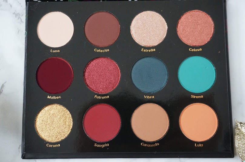
The Salvaje palette contains 12 shades, 8 which are mattes and the remaining four shimmers. I would categorize this palette as warm-toned, but what I found really interesting about it was that the reds were more neutral, even leaning cool. This is quite unique because makeup brands tend to release warm-toned reds, so the two in this palette stand out in my collection.
I’ve noticed a lot of 9-12 pan ColourPop palettes suffer the same problem: they include one or two turquoise/bright shades in the palette, which draws you in to buy it. However, if you take away the one or two pops of colour, you realize all you’re left with is a warm-toned neutral palette. This is one of those palettes!
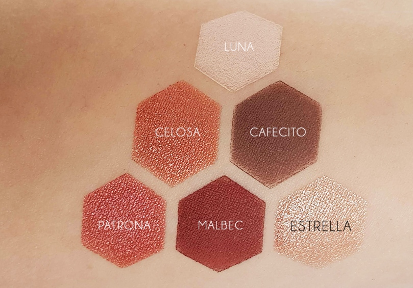
Luna – Matte cream which is good for highlighting or setting your eyeshadow primer with.
Cafecito – Matte medium brown – this is a perfect go-to shade for all types of looks.
Estrella – Shimmery peachy sand. This one has tiny specks of silver glitter in it that I didn’t notice at first and is not noticeable in swatches.
Celosa – Shimmery copper with pink undertones. I find this to be a pretty unique colour!
Malbec – Matte brick red that is great for deepening red looks.
Patrona – Shimmery with a pink shift. Quite similar to Celosa, although it is redder. Also quite an interesting shade.
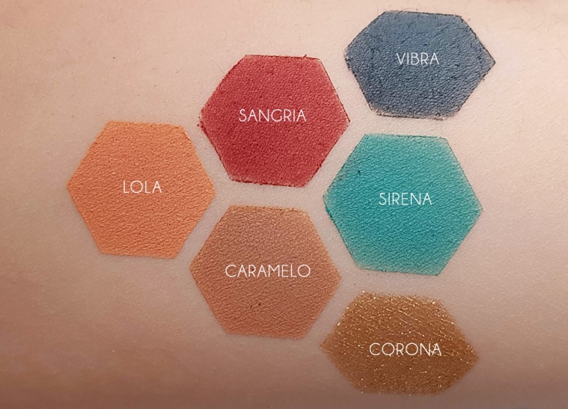
Vibra – Matte deep teal which is great for darkening blue/green looks
Sirena – Matte aquamarine that is great for that pop of colour
Corona – True gold in a foil finish. I personally find this colour hard to wear on my skin tone, but it’s a stunning shade.
Sangria – Deep wine in a matte finish – this is such a strong, vibrant red!
Caramelo – Warm matte camel – the absolute perfect transition shade
Lola – Matte orange creamsicle – this also works really well as a transition shade for your more red-toned looks
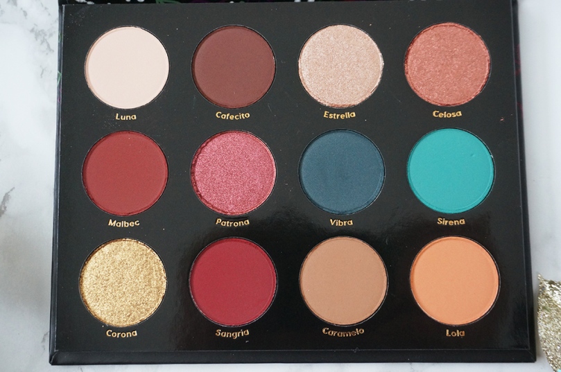
If we’re talking about colour selection in this palette, I find Celosa and Patrona to be really similar; yes, a little different in swatches as you can tell that Patrona is more red and Celosa is more pinky-orange, but they’re not different enough on the eyes to justify having both in the palette. It’s such a pet peeve of mine when I see brands include such similar shades in a palette – it just makes no sense to me! Malbec and Sangria are also a lot alike; again, Sangria is more red-toned than Malbec and is used more as a shade to give more dimension to your looks. While they’re not as close as Celosa and Patrona, they’re still too similar to justify being included in the same palette.

THE PERFORMANCE
I’m starting to see why ColourPop palettes are so popular. Not only are they inexpensive, but the quality is definitely there. All of the shades have great colour payoff
As much as I generally like this palette, it’s not perfect in terms of performance. The most problematic shade in this palette is Corona. It’s one of those foiled eyeshadows that are really loose and crumbly in texture, and it applies very sheer. You really have to pack it on, but then there’s a lot of fallout. There are only four shimmers in this palette, so it’s a little disappointing that one of the four is a poor performer.
Vibra is not a great performer, either. It’s dry in texture compared to the other matte shades, and while it’s a beautiful colour, it’s quite patchy when you first apply it on the eyes, and takes a lot of building up.
Based on both the shades and the performance, my favourite shades are Lola, Caramelo, Estrella, Sirena, and Malbec.
THE LOOKS
Honestly, I found it a little difficult to put complete looks together with this palette. It’s not that it’s hard per se, it’s just that I didn’t like the way a lot of the shades looked together. It took a few trials to figure out some looks that I liked. Part of it could possibly be due to inexperience with using colour on my eyes.
LOOK 1
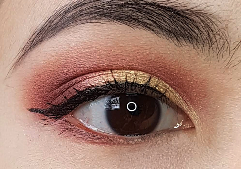
First, I placed Caramelo as my transition shade. Then I took a small blending brush and applied Malbec right above my crease and dragged it up, blending it into Caramelo, as well as into my outer V and lower lashline. Finally, with a small all-over shadow brush, I packed Corona all over the lid, making sure not to go above my crease.

LOOK 2
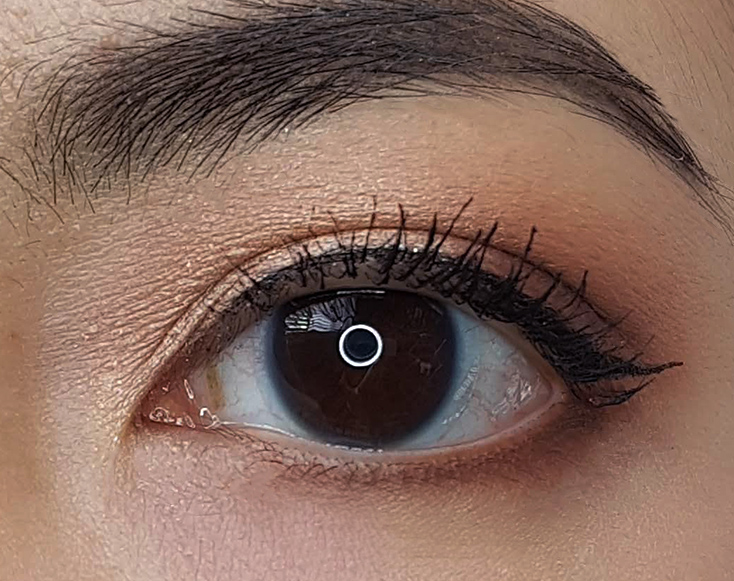
This looks similar to the first look, but I wanted to do something with those shimmery reds. Again, I took Caramelo all over the crease as a transition shade, then Sangria into the outer V to deepen the look. I then applied Celosa into the inner 2/3 of the lid. Lastly, I used a pencil brush to line my lower lashline with Vibra.


Look 3
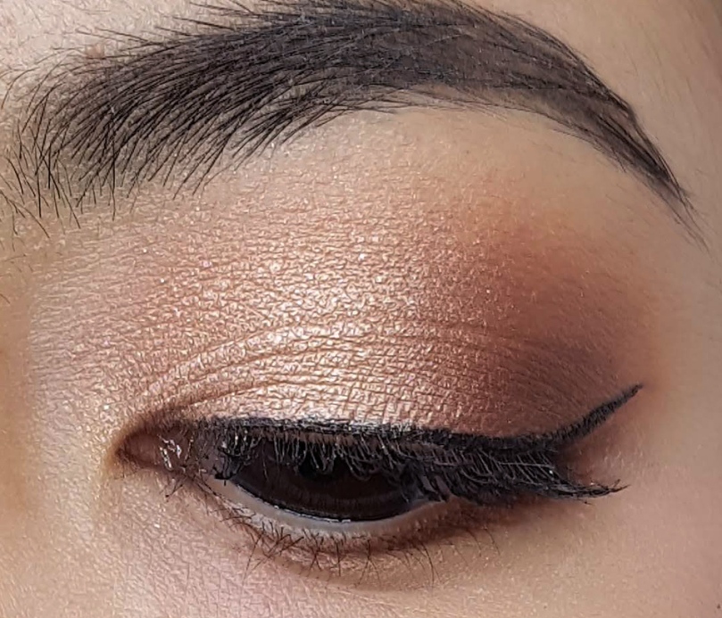
Yeah yeah, I know I took an exciting looking palette and created a boring look out of it, but it wouldn’t be me or my blog if I didn’t do a neutral look. PLUS, to be fair, I did try to make an all-blue eye look with Vibra and Sirena and it was honestly no bueno. I will try again eventually!
For this look, I used Lola as my transition shade, then Cafecito in the outer third of the lid. Lastly, I applied Cafecito into the other 2/3 of the lid.
THE SUMMARY
The Pros
-Affordable
Packaging comes with a mirror
-Great colour selection
-Overall quality of the palettes is high
The Cons
-Contains shades that are too similar to one another
-One or two shades are harder to work with
-Not the easiest to pull complete looks together
As I do in every eyeshadow palette review, I have reimagined the shades in this palette in a way that I personally think will make it better. To be honest, I haven’t changed all that much – just the two shades that I mentioned previously! Since Malbec was so similar to Sangria, I made it deeper so it would look more different and be a better shade for deepening up the outer V area. I also changed Patrona, making it redder to stand out from Celosa.
Overall, this is a solid palette containing high quality shades, although I’m only lukewarm about it. After playing around with it for the last few weeks, I’m not sure how often I will reach for it on its own. I’m more excited to use this with other palettes, to be honest!
Do you own this palette? Let me know what you think of it!

Love the looks you did with this palette! Also… those fun shaped swatches are so cute!! 😊😊😊
LikeLiked by 1 person
Thank you, Robin! 🙂 I got the swatch stencils from the seller IgneousCosmetics on Etsy!
LikeLike
This was such a great review! Me and my sister just started getting into colourpop, and like you said, I can completely see why people love their products! They are so affordable and their products are, for the most part, extremely good! xxx
Melina | http://www.melinaelisa.com
LikeLiked by 1 person
I hope you’re having fun discovering all that ColourPop has to offer! I don’t own a ton of stuff from them, but I’d highly recommend the Super Shock Shadows and Highlighters if you don’t already own any!
LikeLiked by 1 person
I’m glad that you reviewed this! I was on the fence about getting it, but now that I’ve read your review I probably won’t. As you pointed out it really is just a neutral palette with two pops of bright colour.
I had the exact same issue that you did putting looks together with this palette as when I was working with the Rendezvous palette. All the shades look so pretty in the pans but when I tried to combine the colours I felt kind of lost :S I do really like the looks that you put together, the first one is my favourite!
I love that you reimagined the palette in a way that you would like to see it. I like your version of the salvaje palette more than the original. Great review!
LikeLiked by 1 person
Yeah, I don’t think you should feel like you’re missing out on this one. I haven’t really even touched my Rendezvous palette, so it’s interesting to hear you say that you struggled putting the shades together with that one too. Maybe I’ll try putting these two palettes together into cohesive looks!
LikeLike
I that I lost interest when it was discontinued, I get really excited when I’m reviewing something for my blog but when it was discontinued it didn’t feel as relevant to me anymore. The blue shade is fun though!
Let me know how it goes combining the two palettes!
LikeLike
This palette though! I’m in love with the packaging! I have to agree with you, it’s a beautiful palette but it’s not a palette I’ll gravitate towards on an everyday basis. I love your looks, soo gorg! x
LikeLiked by 1 person
Thank you, beauty!
LikeLiked by 1 person
I had a little giggle to myself that all of the looks you did were neutral. But I suppose they aren’t entirely neutral, you do have the burgundy’s in there. I guess just as I was scrolling through I was looking for those blues. Do you ever think you will use them? Sirena looks so pretty!
I’m glad that overall you did enjoy the performance of this palette! CP is my favourite eyeshadow formula at this point! It’s too bad that you don’t love the palette as a whole though. I do think that it was a good step to pushing you out of your comfort zone though!
LikeLiked by 1 person
Hahaha in my own defense, I don’t know if I mentioned it in my blog post or not, but I tried several times to do a look with the blues and they looked horrible, so I didn’t share them on my blog. I don’t know if it was because of my inexperience working with blues, the fact that I didn’t think the two blues went well together, the quality wasn’t great, or a combination of the above. Even looking up YouTube tutorials to get inspiration on the blues, I found very few people used them on the lid and mainly used it to line the lower lash like I did. Plus I define “neutral” as something I could wear to work, and I would only feel comfortable wearing 1 of those looks to work, but I know what you mean because they’re not as “out there”.
Lol I think between this one and the other two colourful CP palettes I got in the same haul, I am done with accumulating colourful eyeshadows in my collection!
LikeLiked by 1 person
Oh no!! That’s too bad the blues weren’t good! They can often be more difficult to work with.
LikeLiked by 1 person
Haha maybe that’s why…I guess I just need more practice! Hopefully one day I’ll be able to share something I’m happy with 🙂
LikeLiked by 1 person